top of page


Gatherings by cp
logo and packaging evolution
Gatherings by Curated Paperie is an independent boutique specializing in elevated paper tableware and decor. The company started out curating other companies' items to learn the market, then transitioned into an in-house line of products.
Packaging design is an evolving process, as the brand grew and each collection launched, the design was refined to better reflect where Gatherings was headed.
logo evolution
The logo started out full color and only had a horizontal version
A circular version was added to work on social media and circular stickers.
The brand evolved into using a single color logo. The color of the logo or background changed depending on the use or season.


label design evolution
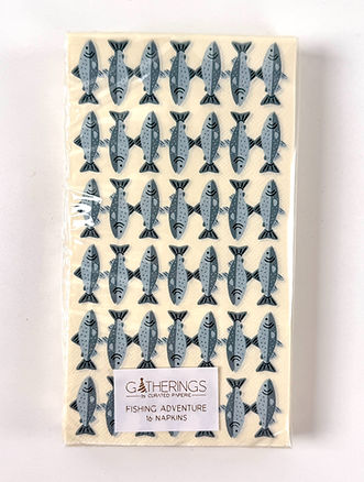
Cocktail Napkin & guest towels


Early label designs featured the full color logo along with the pack size in an orange bar on the front. The back label was quite large and featured more information than necessary like the full address, and the product title.
The next iteration streamlined the information on the label. The wrap-around design was made to streamline production, but in practice it compressed the product. That feedback directly informed the next iteration.


The current iteration of the packaging went back to single labels on the front and back. The front label was changed to all gold foil for a more elevated look. The back label features a mix of gold foil and black printing for the UPC and smallest printing for ease of readability.

Here are two different Fourth of July collections. The left is an earlier collection featuring the wrap around label. The right is the current labeling design. Side by side you can see that the current simple and elegant design lets the product shine and doesn't pull focus while giving the brand a more elevated look.

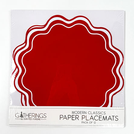
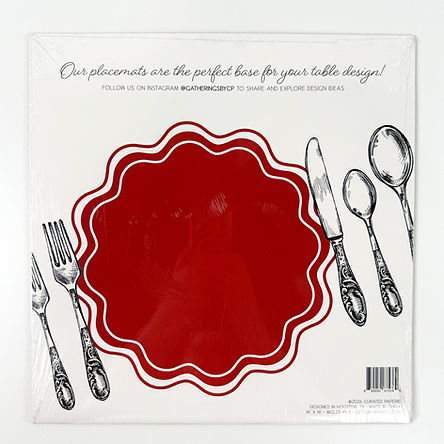
paper placemats
The placemat packaging has always used a foldover card design. Early versions featured the full color logo, centered text, and an illustrated place setting, and some had oversized UPC codes that got scaled back in later iterations. The current design elevated the look with gold foil on the logo and select lettering on the front, and a more dynamic composition on the back giving the packaging a more premium feel. A chipboard insert was also added, which gave the packaging enough structure to display vertically on a shelf. Earlier versions couldn't stand on their own.
early design


current design
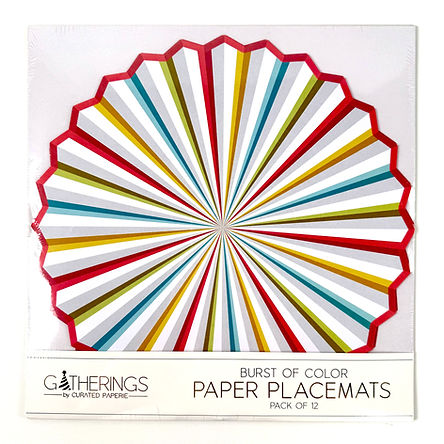
The Burst of Color placemat was designed as part of a birthday collection, and unlike the other packaging examples shown here, I designed the product as well as the packaging. The radiating pattern was inspired by a paper fan, a nod to the party decorations the placemats would sit alongside on the table. The scalloped edge is die-cut, giving the placemat its own shape rather than a standard circle. The color palette was selected to feel festive and celebratory without being tied to a specific theme, so it could work across a range of birthday settings.

Paper Appliques
These die-cut appliques are designed to stick onto cups, bottles, treat bags and more, letting customers extend a theme across their whole table. Since the shapes are irregular, a backer card was needed to keep the product stable in packaging. The Gatherings icon was used in a scatter pattern on the card to add visual interest and reinforce the brand. Because the product isn't immediately self-explanatory, the back of the card includes custom explainer illustrations showing how the appliques can be used, along with product info and the UPC code.


plates
The Radiance plate design started as my hand-drawn illustration in Procreate. The radiating brushstroke pattern was designed to feel energetic and bold, working equally well as a standalone statement piece or as part of a larger table setting. The design was produced in multiple colorways, with this version featuring gold foil printing for a more elevated look.


bottom of page